|
BOND WAVE MAPPING: CASE STUDY 2
Price & Inflation Cycles Along the Bond Wave Originally published July 23, 2016
Last edited January 2, 2022 By Michio Suginoo This section reviews transformations in the relationship between price behaviours and the bond wave (sovereign bond yields of a leading economic and political powerhouse).
Sidney Homer left us a notion that the state of money has something to do with the evolution of the Western civilization. And it extends to a scale of one life cycle of civilization. In studying the bond wave, I intend to contemplate Homer’s notion in a shorter horizon, say secular time frame. In other word, we can use the bond wave to observe a long-term transformation in the relationship between bond yields and other metrics. My attempt is to capture a notion that the state of money mirrors a broader socio, political, and economic reality. Bond wave mapping provides a heuristic approach to apply historical analogy to make relevant questions about our present and future based on our past. Overview
In general, the following components constitute bond yields:
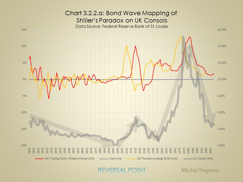
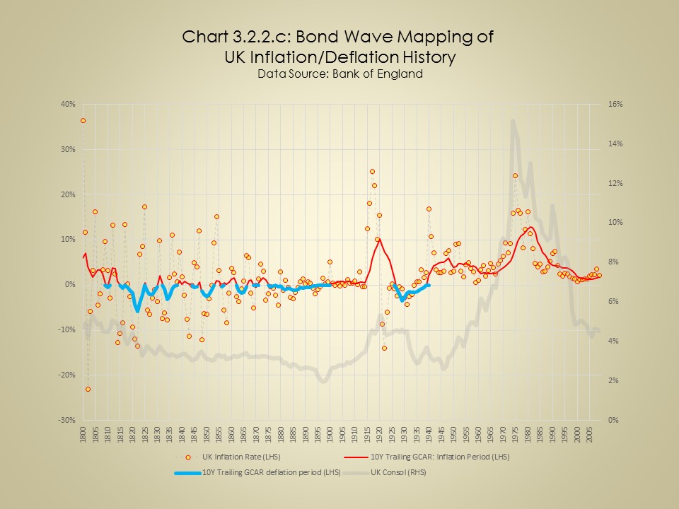
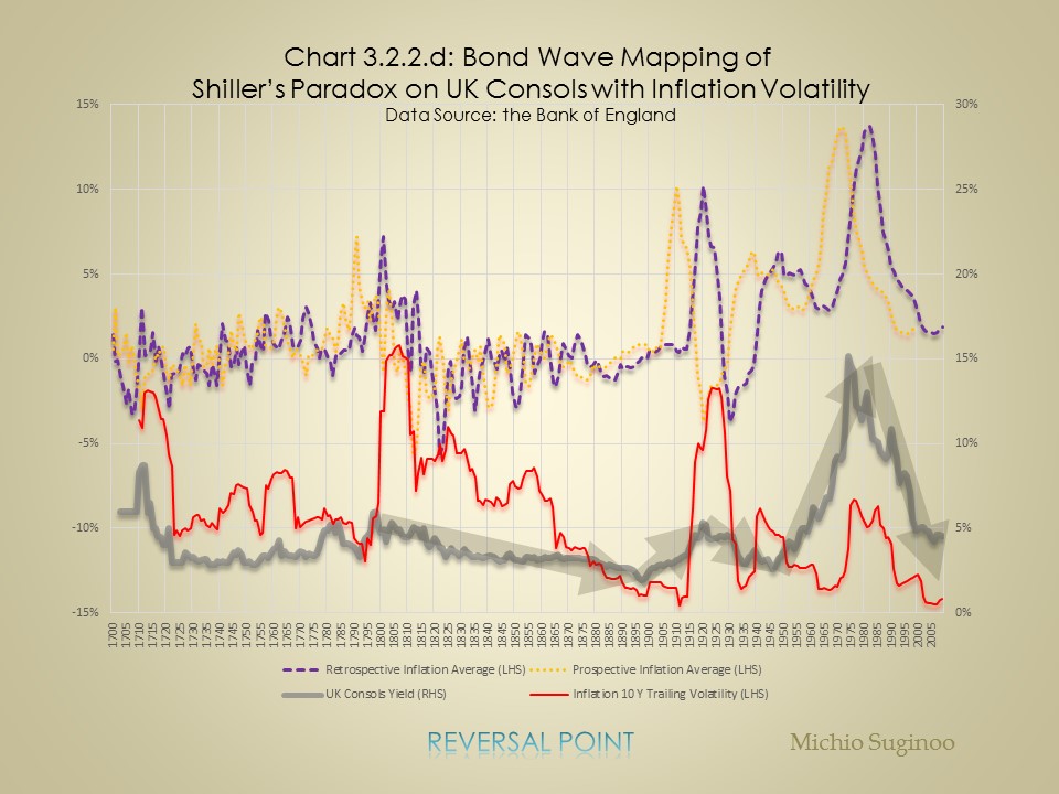
And in this reading, we only focus on the relationship between the bond wave and inflation rate, presuming the variability in other components being non-material in a secular scale: this assumption needs to be tested in other readings. Chart 3.2.1 illustrates the relationship between the bond wave (bond yields of the UK Console) and price cycle (the cycle of the log of price level) in the United Kingdom. The chart demonstrates a couple of salient features:
As a precautionary footnote, throughout this reading, the term 'cycle' refers to irregular dynamics, not regular ones, in terms of both magnitude and duration. 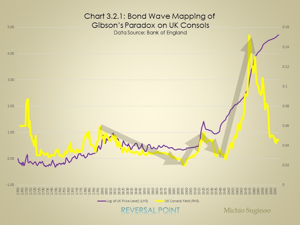
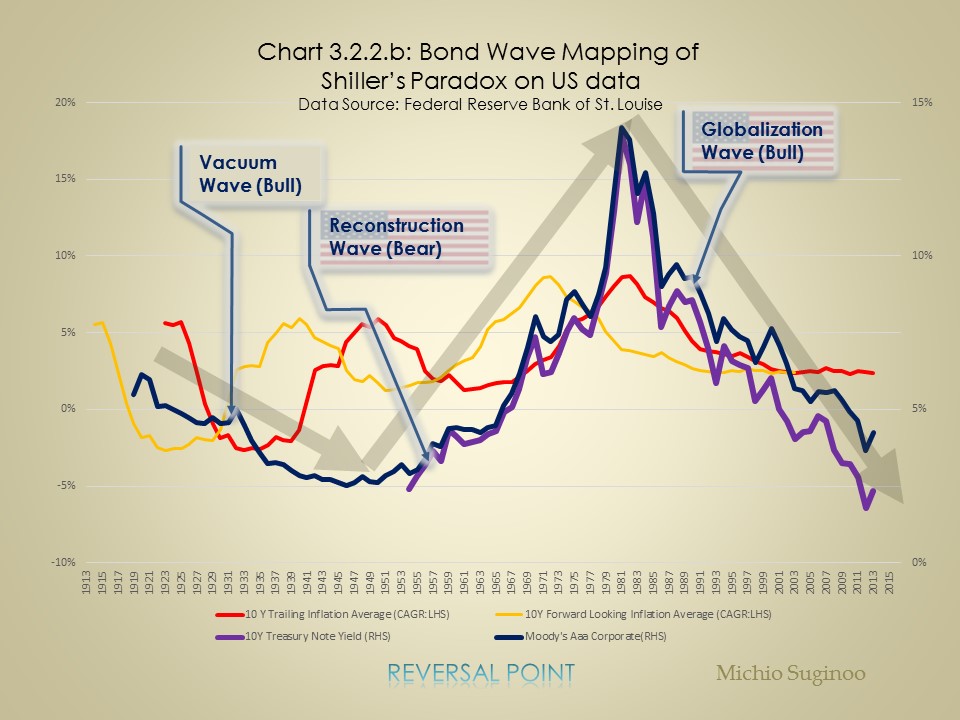
Below, Chart 3.2.2.b illustrates the relationship between the bond wave and inflation cycle.
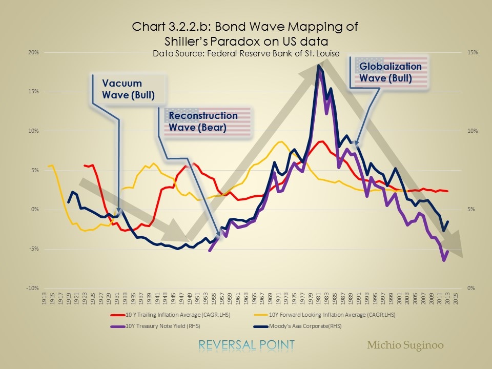
From these two charts, the following two observations can be made.
|